01
Highway
2024
As a UX researcher and designer on the Highway Freight Platform project, we worked to enhance the carrier vetting process for freight brokers. Highway’s directory is a critical tool, providing brokers with data to evaluate carriers for safety, compliance, and reliability. However, the existing platform posed significant usability challenges. Data was scattered across multiple pages, visual cues were overwhelming and confusing, and decision-making was hindered by unclear metrics.
Our goal was to simplify the directory experience, empower brokers to make confident decisions, and reduce cognitive overload by creating an intuitive, efficient platform.
Here's Highway Platform:


02
Process
Problem Statement
Freight brokers faced significant barriers in using the Highway directory effectively:
Scattered Information: Key carrier data was dispersed across multiple screens, requiring constant navigation.
Overwhelming Visual Cues: Excessive use of color-coded indicators caused confusion.
Unclear Metrics: Brokers struggled to understand how individual data points contributed to overall carrier ratings.
Problem Reframing
From the insights of primary research, we redefined the problem to focus on creating clarity and efficiency:
Initial Goal: Reduce information overload.
Refined Goal: Create a streamlined carrier vetting process by consolidating information, clarifying visual cues, and aligning the interface with user workflows.
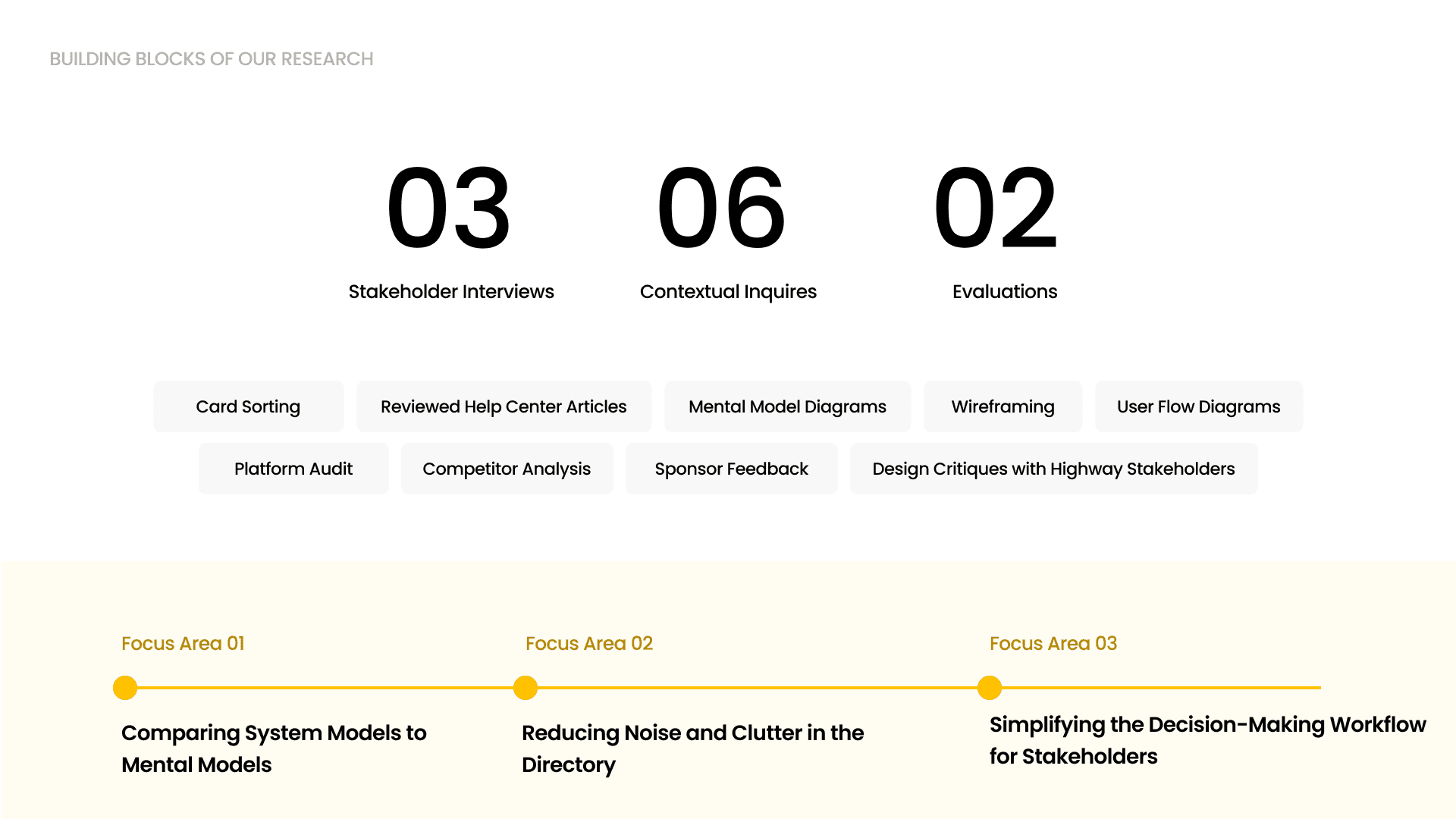
Research: Understanding the Users
I primarily focused on understanding the pain points of freight brokers, the primary users responsible for vetting carriers. My approach included:
Stakeholder Interviews: I collaborated with sales reps, operations managers, and leadership to uncover usability challenges and understand business priorities.
Platform Audit: I conducted a detailed review of the existing directory to identify gaps and areas for improvement.
Key Insights
Through this research, we uncovered the following pain points:
Brokers felt overwhelmed by excessive, non-intuitive color-coded indicators, making data hard to interpret.
There was a lack of clarity in how individual metrics influenced the overall carrier rating.
Scattered data forced users to switch between multiple screens, increasing decision-making time.
Brokers were unaware of internal system rules, leading to confusion about carrier statuses.


03
Outcome
The redesigned directory transformed the vetting process for freight brokers, delivering measurable improvements:
50% Reduction in Navigation Time: Brokers could access all necessary information in one place.
30% Faster Decision-Making: Simplified visuals and clear data presentation empowered quicker and more confident vetting.
Increased User Satisfaction: Brokers reported feeling more confident in their decisions and appreciated the improved usability.

04
