

Google Guidebooks
Content Strategy
UX Research
Learning Experience Design
Designing how people learn inside products.
Background
A systematic redesign of in-product learning
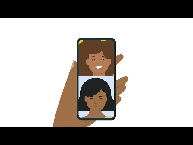
Google Guidebooks help users learn how to use Google products through short, in-product lessons. The goal was not to redesign UI, but to make guidance usable during real tasks.
Approach
Working on the experience layer, not just the interface.
Instead of changing how the product looks, I redesigned how information is structured. I aligned content to user goals, simplified sequencing, and reduced cognitive load.
The result was a task-based, modular learning experience rooted in UX and learning science principles.
Impact
↑55%
in engagement with interactive content
↓ 40%
time taken to find relevant instructions
↑80%
due to task success rate (up from 55%)
Overview
Client: RitaABC
Timeline: June 2024 – Dec 2024
Tools Used
Figma · Sketch · Usability Testing
Role
Content Strategy
Learning Experience Design Team
Methods
Journey Mapping, Usability Testing
Content Structuring
Project Context
Third party vendor
Problem
The content was correct. The experience wasn't.
Guidebooks were structured around product features.But users weren't trying to learn features; they were trying to complete tasks.
This mismatch made guidance harder to use in real moments, even when the information itself was accurate.

Core Insight
Users don't learn features. They complete tasks.
I focused on surfacing AI value earlier and placing key actions where users already expected them.
- Make the assistant more visible.
- Surface milestones directly in the journey
- Expose important settings through clearer pathways
Feature Based
"What does this do?"
— Product first structure
— Feature explanations
— Passive reading
Task Based
"How do I get this done?"
— Goal first structure
— Action- oriented steps
— Active doing

Approach
Restructuring how users learn
Align content to real user goals
Map every piece of guidance to an outcome the user is trying to reach, not a feature the product provides.
01
Sequence steps based on action flow
Order information the way users move through tasks — from intent to completion, not from UI hierarchy.
02
Reduce cognitive load during execution
Surface only what's needed in the moment. Remove context that belongs elsewhere.
03
Solution
Three design decisions that changed the experience
We reimagined the guidebooks to feel more like learning experiences, not instruction sheets, empowering users to explore, act, and learn in real-time.
01 — Task-based content design
Replace passive pages with actionable steps
Replaced passive feature descriptions with actionable, verb-based steps.
Focused on outcomes, not explanations.
Every guide answers: what do I do next?
02 — Visual-first learning
Improve scanning through hierarchy and cues
Reduced reading effort by improving scannability.
Used iconography, typographic hierarchy, and clear labelling to guide attention to what matters.
03 — Interactive & adaptive guidance
Deliver help when it's actually needed
Introduced contextual help through walkthroughs, tooltips, and expandable hints. Guidance appeared when needed, not all at once — reducing overwhelm and improving retention.
Process
Designing within constraints
Each decision translated a specific research finding into a concrete improvement to visibility, discoverability, or flow.
This project was not discovery-heavy. Constraints were predefined — but that's where the real design work began.
Fixed layout system
Strict content standards
Accessibility requirements
Instead of redesigning components, I focused on restructuring information.
Clarity comes from sequencing,
not reduction.
Before/After
From feature-based to task-driven.
Before
Feature Based
— Feature-focused structure
— Dense information
— Higher cognitive load
After
Task Driven
— Task-based flow
— Clearer sequencing
— Easier scanning and action
Impact
Measured Outcomes
↑ 55%
Engagement with guidebook content
↓ 40%
Time to first meaningful interaction
↑ 80%
Task completion success rate
Reflection
Designing for learning is not about explaining more.
It is about helping users act with less effort. Structure, sequencing, and context do more than volume ever could.
Here is another project I worked on!

Highway
Rebuilding how freight brokers evaluate and act on carrier information
B2B Saas
UX Research
Interaction Design
↑ 9x
Faster access to key risk signals
↓ 30s
Time to evaluate
carriers
↓ 80%
Workarounds after
redesign
Want me to scale your product with you?
Let's chat!