
Nurse
Network
UX Strategy & Design
Empowering nurses to work without the paperwork
I led UX design for Nurse Network, a field service platform that digitized how a Fortune 500 health tech company's nurses manage offers, complete trainings, and execute patient visits - replacing a paper- based with a mobile app and allocation web portal.
DURATION
8 months (Feb 2023- Sept 2023)
MY ROLE
UX Designer
METHODS
Discovery Workshops, Landscape Analysis, Wireflow Mapping, Stakeholder Presentations

This is only a snippet of my work! Happy to share more over a call!
Before any design work, we mapped out what a nurse's day actually looked like.


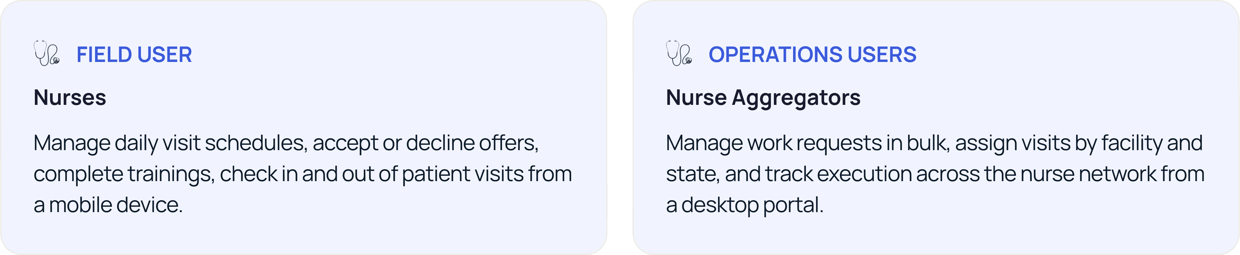
The challenge wasn't just digitizing a paper process, it was balancing what nurses needed in the field with what the business needed at scale. As we dug in, it became clear these weren't the same problem. Two distinct personas were using the platform for entirely different purposes, and designing for one without the other would have broken both.
Goal
We reframed our how might we to encompass both use cases — so both users could get what they needed.

Solution
We designed two tailored platforms, a mobile consumer app for nurses and a web allocation portal for operations teams, each solving a distinct set of breakdowns in the existing workflow.


Impact
Post MVP launch, the platform showed strong adoption and measurable efficiency gains across both user groups.

Additionally, a 20% reduction in time taken to execute patient visits was observed, and the company is now expanding the white-labelled product to additional geographic regions.
But, How did we make these decisions?
We ran cross-functional discovery workshops with client stakeholders to map the existing paper-based workflow, surface pain points, and align on a product vision. The workshops combined blue-sky thinking and structured feature ideation to move from problem context to opportunity space.

Findings
The workshops surfaced three core tensions that shaped every subsequent design decision:
Finding 01
Paper creates dangerous gaps
Manual forms meant no real time visibility into visit status, completion, or nurse availability, leaving operations blind.
Finding 02
Standard patterns don't apply
Nurses are using their phones outdoors, with gloved hands, mid-visit. Standard mobile UI patterns weren't sufficient.
Finding 03
Two workflows, two tools
Field execution and office allocation had opposite needs. A single product would fail both, they required separate, tailored surfaces.
Definition and Design
With a concept direction validated, I mapped the full information architecture for the mobile app, then designed connected mid-fidelity wireflows rather than isolated frames. This was a deliberate choice:
Decision 01 - Field-first UI constraints
Typical mobile design patterns assumed a user sitting down with full attention. Nurses operate differently: one hand on equipment, gloves on, sunlight washing out the screen. We set explicit design constraints:
Tradeoff
Prioritizing accessibility and field usability meant the interface is deliberately simple — which some stakeholders initially pushed back on. We held the constraint, and it's reflected in the 75% offer acceptance rate post-launch.
Standard Mobile
Small tap targets
Low-contrast secondary text
Multi-step forms in sequence
Field-First
Oversized CTAs, glove-safe targets
High-contrast throughout
Progressive disclosure in forms
The appointment and travel flow covers everything from the moment a nurse starts their day to the point they check in — designed so every state transition is explicit and recoverable.

The post-appointment flow handles what happens after the visit, marking tasks complete, logging patient updates, and travelling back, closing the loop on the full visit lifecycle.

Decision 02 - Separate allocation portal for operations
Once it was clear that nurse aggregators had fundamentally different workflows, managing work requests in bulk, reviewing assignments by facility and state, creating new requests, we designed a dedicated web portal with a data-dense table view rather than forcing this into the mobile app.
This decision kept the nurse mobile app focused and uncluttered, while giving operations a purpose- built tool that matched their desktop-first, data-heavy workflow.

Work Requests - Visit Allocation

Work Requests Creations
Impact
Post MVP launch, the platform showed strong adoption and measurable efficiency gains across both user groups.
Additionally, a 20% reduction in time taken to execute patient visits was observed, and the company is now expanding the white-labelled product to additional geographic regions.
Learnings and Reflections
01
Test in the actual environment sooner. We validated flows in standard usability settings, but the field-first constraints were defined by assumptions from discovery rather than observed use.
02
The allocation portal was designed closer to stakeholder-directed requirements. A round of contextual inquiry with nurse aggregators would have strengthened the web portal's information architecture.
03
What this project taught me: Digitizing a manual process isn't just about moving paper forms onto a screen. The real design work is understanding where the paper process has been working as a workaround for a deeper problem and deciding which of those workarounds to respect, and which to redesign.
OTHER PROJECTS
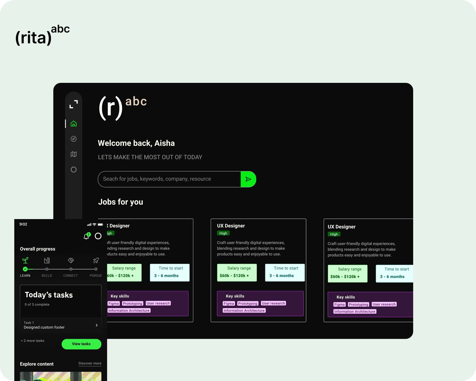
Designed the 0→1 product experience for an AI career platform to guide your career decisions

Redesigned Google's in-product lessons so users could learn how to use their products better
View all work
User Research
Got something complex?
UX Strategy
Let's untangle
Learning Design
it together!
Experience Design
Feel free to reach out to me personally via sending a message, or schedule a time to say hello!
Made with care and strategy in Framer
All rights reserved @ Priyanka Ghosh 2026