
Learning Experience Design
Helping users get the most of their Google products
Google Guidebooks help users learn how to use Google Products through short, in product lessons. As a Learning Experience Designer, my goal was to make guidance usable during real tasks. I aligned content to user goals, simplified squencing, and reduced cognitive load. The result was a task based modular learning experience rooted in UX and learning science principles.
DURATION
Jan ‘24 - May ‘24
MY ROLE
Content Strategy & Learning Experience Design (Contract)
METHODS
Content Strategy, UX Writing, Information Architecture, Instructional Design

This is only a snippet of my work! Happy to share more over a call!
Google's Guidebooks were accurate. But they were organized around how Google thinks about its products, not how users think about their tasks. A user trying to free up storage space doesn't search for "Google One storage management." They search for "why is my phone full."
That gap between how features are documented and how users experience problems — that was the design problem.

A designer would ask: how do we present this feature clearly? An LXD asks: what is the user trying to accomplish, and what do they need to know first to get there? That question changes the structure of everything.

Design Decision
Reframing from features to tasks meant reordering, cutting, and sometimes adding lessons that the product team hadn't thought to include.

Solution
Four moments where applying a learning principle produced a better result than following design instinct alone.
Sequence by what users need to know first
If a lesson assumes knowledge the Guide hasn't taught yet, users drop off. I audited every sequence against one question: does the previous lesson give you what you need for this one?
Improve scanning through hierarchy and cues
Used iconography, typographic hierarchy, and clear labelling to guide attention to what matters.
Replace passive pages with actionable steps
Replaced passive feature descriptions with actionable, verb-based steps. Focused on outcomes, not explanations.
Learnings and Reflections
01
The best decisions came from both sides being in the room. They knew their users. We knew learning design. Neither worked as well without the other.
02
A lesson isn't done when it reads well on one screen. It's done when it holds up on a Pixel, on a browser, in a different language, for a user who arrived from a Quick Tip instead of the beginning of the Guide. Thinking across that full surface area is now a baseline assumption I bring to every content and design problem I work on.
03
Thank you to Jennifer and Mickey for being super supportive in this experience!
OTHER PROJECTS
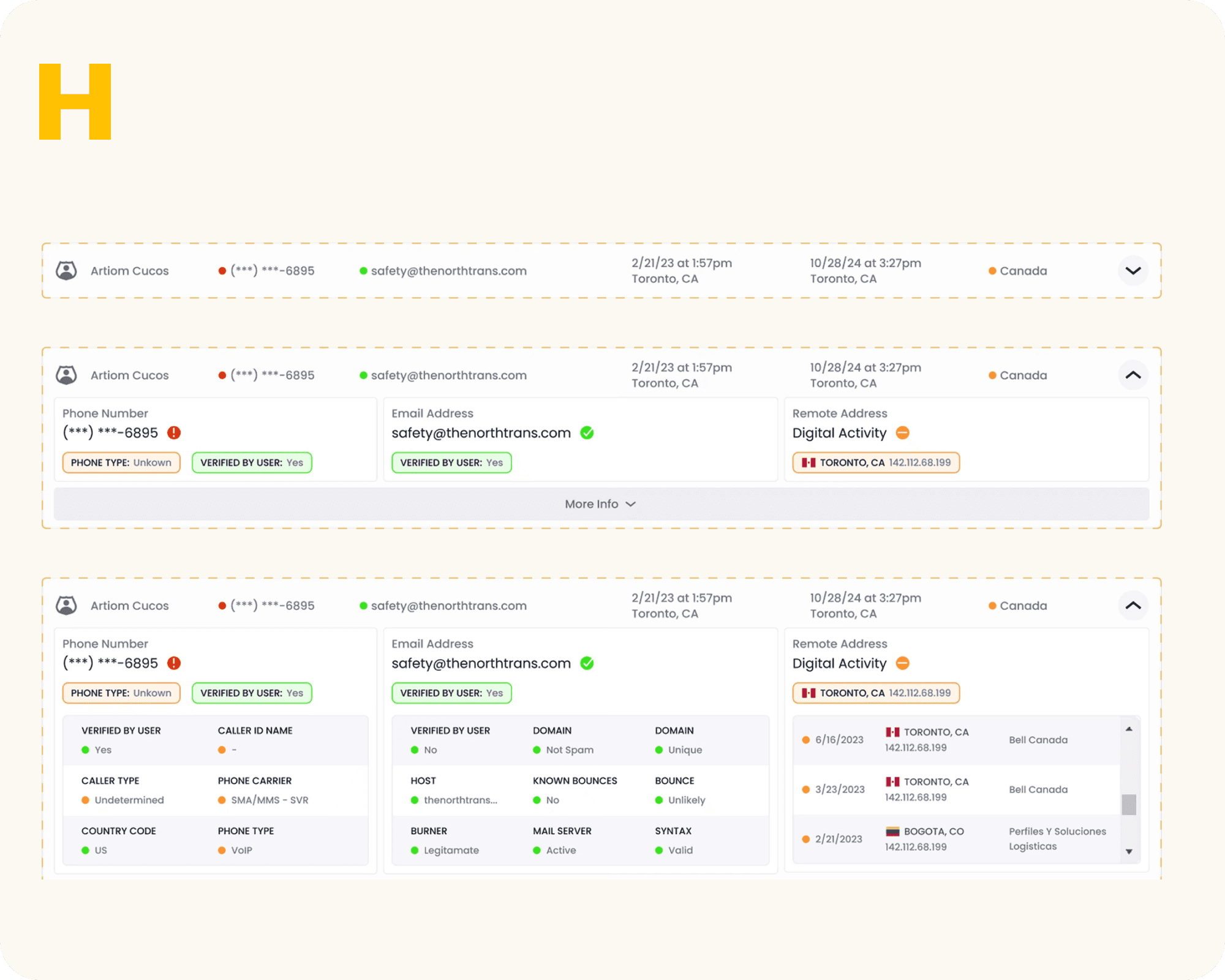
Restructured a carrier vetting platform to help freight brokers vet faster

Designed a mobile app and web portal to digitize visit execution for field nurses
View all work
User Research
Got something complex?
UX Strategy
Let's untangle
Learning Design
it together!
Experience Design
Feel free to reach out to me personally via sending a message, or schedule a time to say hello!
Made with care and strategy in Framer
All rights reserved @ Priyanka Ghosh 2026