

OVERVIEW
UX Research & Design
Helping freight brokers make confident decisions
I led user research and feature designs for Highway, a carrier vetting platform that helps freight brokers detect fraud and verify carrier identity before onboarding. The work focused on restructuring the Directory, Highway's core vetting workspace to reduce cognitive load and help brokers make faster decisions. The redesign shipped three features, cutting contact lookup time by 40%
DURATION
6 months
MY ROLE
UX Researcher & Designer (Sponsored Project)
METHODS
Contextual Inquiry, Platform Audit, Mental Model Mapping, Stakeholder Interviews


Early research and a platform audit revealed why — two distinct broker roles, each with different vetting needs, both spending most of their time in the Directory that wasn't designed around either of them.

Goal
This led us to reframe our goal from reducing clutter to restructuring how information was prioritised — so both users could get what they needed, without changing what was there.

Solution
We restructured the Directory's information architecture across three targeted features, each solving a distinct breakdown in how brokers find, read, and act on carrier data.
Improved Directory Navigation

Progressive Disclosure for Contacts

Context Relevant Terminology

Impact
The redesign was well received by Highway's product team, with most of the features approved for the production pipeline following stakeholder review.

But, How did we make these decisions?
We conducted 3 stakeholder interviews, 6 contextual inquiries, and 5 evaluations. I specifically led the platform audit, mental model mapping, and usability testing.

Findings
The audit and primary research pointed to the same three breakdowns, in how brokers navigate contacts, read risk, and make sense of data under pressure.

01
Brokers navigate by role
CSRs and CLs both search for a contact type "dispatch" or "billing", not an individual. The flat, unsorted list forced them to scan everything.
02
Speed and depth are opposing needs
CSRs needed to vet in under 30 seconds. CLs needed to investigate thoroughly. One interface was trying to serve both, and failing both.
03
Trust was breaking down at the point of decision
When brokers couldn't quickly make sense, they'd call the carrier directly to verify bypassing the platform entirely.
Design Decisions
Decision 01 - Contact Findablity
I proposed + led
Restructure contacts around how brokers actually search
Research showed brokers looked up contacts by role — dispatch, billing, claims — not by name. The flat list had no concept of this. I proposed role-based tab filters, in-profile search, and pagination to match the mental model brokers already had.
Tradeoff
I chose to add tabs over a global search because role is the primary filter — search alone would still require brokers to know what they're looking for. Tabs narrow the list first; search handles edge cases within that.

Added role based tab filters
Role-specific tabs narrow the list instantly. Also, introduced a tab for inactive tabs, the old directory listed all active and inactive tabs in the same list.

Side Navigation
Brokers were scrolling to navigate between sections within a carrier profile. A sticky side nav let brokers jump directly to the section they need.

Search for carrier profiles
Looking up a specific contact by phone or email without scrolling through the entire directory or using CMD + F workaround and without leaving a carrier profile to use the main website search.

Pagination
Broke a long, unscrollable contact list into manageable pages with max 10 contact cards, reducing visual overwhelm.
Decision 02 - Risk Labels
I designed
Replace binary Yes/No labels with context-specific semantic language
Card sorting with compliance leaders revealed brokers already had words for what they were seeing, the platform just wasn't using them. I replaced Yes/No with labels that matched broker reasoning: Legitimate, Likely Bounce, Not Verified.
Tradeoff
Semantic labels required alignment with Highway's compliance team to ensure accuracy. I chose this over a colour-only fix because colour alone doesn't survive edge cases, language does.
Before
Binary Yes/No Labels for Risk Indicators

Brokers had to interpret multiple Yes/No labels that contradicted color signals.
After
Context-specific Semantic Labels

Risk indicators lack clear prioritization, forcing brokers to manually verify data points.
Uncategorized Identifiers in Carrier Profile Header
Brokers manually copy these identifier numbers to external sites as part of their additional vetting process. Amongst all the carrier and vehicle identifiers, brokers use the DOT number most frequently to copy-paste in other vetting tools as part of their workflow.
To make the process of locating DOT and copying it, I've added a click-to-copy feature.
Before
Manually Copy from Uncategorized Identifiers
Risk indicators lack clear prioritization, forcing brokers to manually verify data points.

No Categorization & Visual Hierarchy of Identifiers
No context of what these numbers are
Manually Copying Each Identifier is tedious for brokers
After
Copy Identifiers Faster
Brokers can copy identifiers in one click.
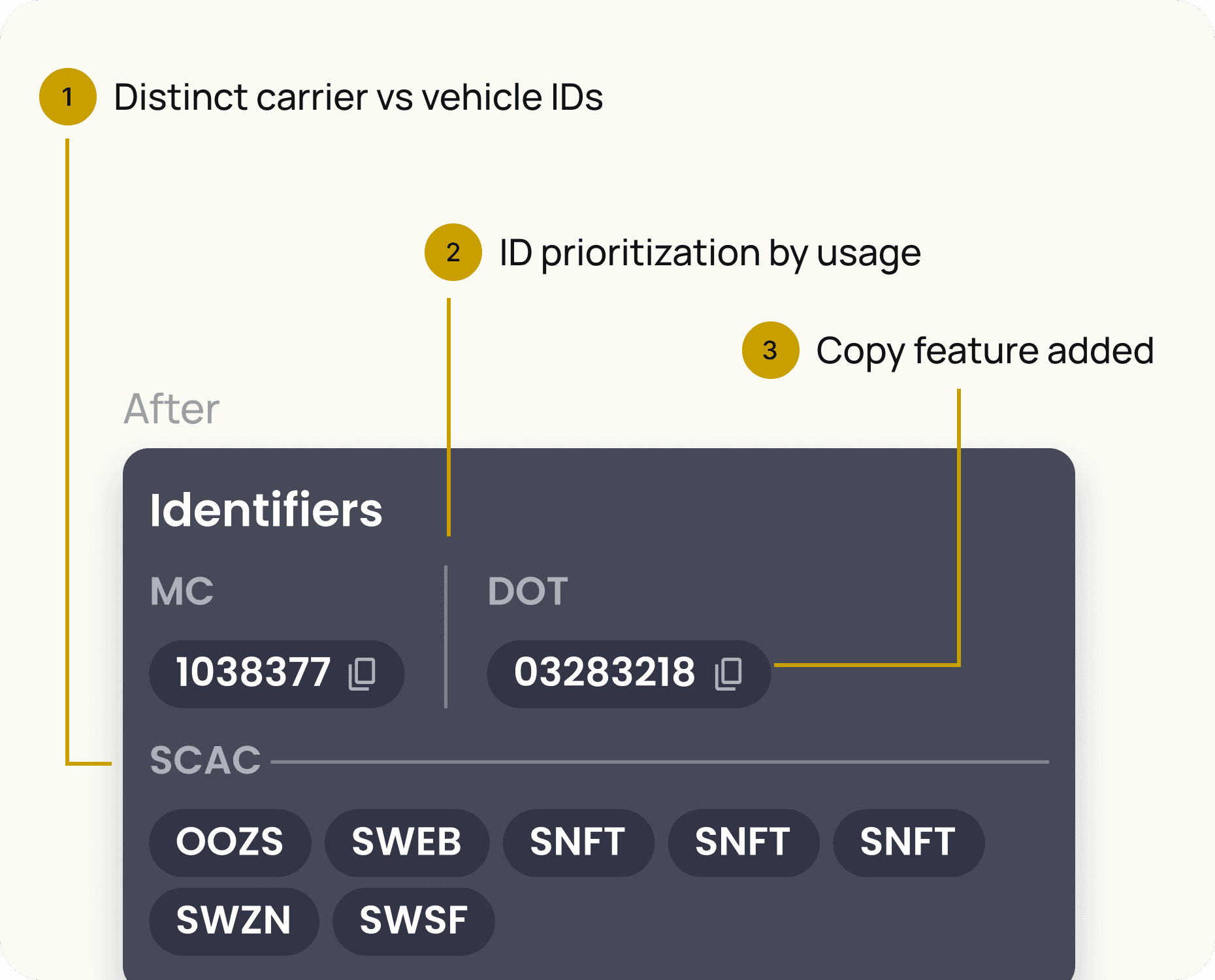
Distinct carrier vs vehicle IDs
Commonly used identifiers prioritized on top
Click to copy feature added
Impact
The redesign was well received by Highway's product team, with most of the features approved for the production pipeline following stakeholder review.
Learnings and Reflections
01
Validate tone over time: Preference testing shows what users like in a session. It doesn't show what drives engagement at day 30. That's the next test to run.
02
Validate tone over time: Preference testing shows what users like in a session. It doesn't show what drives engagement at day 30. That's the next test to run.
03
Validate tone over time: Preference testing shows what users like in a session. It doesn't show what drives engagement at day 30. That's the next test to run.
OTHER PROJECTS
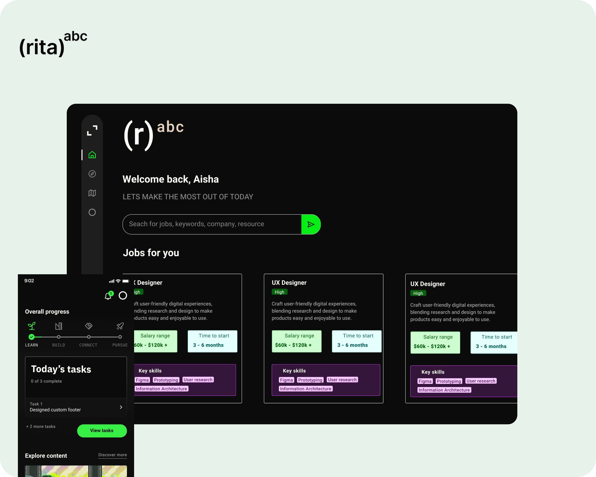
Designed the 0→1 product experience for an AI career platform to guide your career decisions

Redesigned Google's in-product lessons so users could learn how to use their products better
View all work
User Research
Got something complex?
UX Strategy
Let's untangle
Learning Design
it together!
Experience Design
Feel free to reach out to me personally via sending a message, or schedule a time to say hello!
Made with care and strategy in Framer
All rights reserved @ Priyanka Ghosh 2026