
RitaABC
Conversational Design
0→1
Product Research & Strategy
Designing how an AI learning product becomes understandable, usable, and trusted
Background
The AI existed. The experience didn't.
Rita ABC is an AI-first learning platform that creates personalized career paths based on a user’s goals and experience. It generates roadmaps, milestones, and daily tasks to guide skill-building or career transitions.
When I joined during beta, the product had strong AI features, but the experience lacked clarity. My focus was to make the AI easier to find, understand, and act on.
Approach
Working on the experience layer, not just the interface.
Instead of focusing only on interface polish, I worked on the experience layer behind the product. My work focused on understanding how users discover and interpret AI features, testing how tone and wording affect trust and engagement, defining AI input → output behavior, improving the visibility and structure of key flows, and translating research into clearer interaction and onboarding decisions.
This meant shaping not just screens, but how the AI behaves, communicates, and supports decision-making.
Impact
↑ Better visibility of AI-powered features
Key features were easier to locate and understand
↓ Friction in core flows
Improved navigation for features on the application
↓ Stronger clarity and engagement
Better response tone and structured AI guidance
Overview
Client: RitaABC
Timeline: May 2025 – Aug 2025
Tools Used
Figma, Dovetail, Notion, Usability Testing
Role
Product Research & Strategy Intern
AI Experience Design
Methods
Usability Testing, A/B Testing, Information Architecture, Voice & Tone Design, AI Interaction Logic
Project Context
0→1 startup (beta), Internship
Problem
The AI existed, but the experience was fragmented.
Rita ABC already had the right ingredients: an AI assistant, personalized milestones, onboarding flows, and adaptive learning support. But in practice, the experience was fragmented.
Users couldn't easily find core AI features, the system didn't always gather enough context before responding, and onboarding and guidance lacked structure.As a result, the product's strongest value was present, but not always legible.
After conducting 1:1 meetings with key stakeholders and performing preliminary research, I refined the problem statement and reframed it using the extended Jobs to Be Done framework:
As a user navigating a skill or career transition, when I engage with an AI driven platform,
I want it to build an accurate understanding of my context, so it can guide me through a structured and personalized path.
But, in the current designs,
“I don’t really know where to start or what the AI needs from me. It just gives me something, but I’m not sure it’s right.”
“I feel like the system is guessing. It doesn’t really understand my situation before giving suggestions.”

Enter password to view case study
Goal
How might we help users feel understood and guided from their first interaction to improve onboarding and early engagement?
Approach
How I approached the problem
Rather than treating this as a visual redesign, I broke the work into three connected problems.
Discoverability
Users couldn't find the AI. Core features were present but invisible within the interface.
01
AI Behavior
The AI didn't know enough to help. It needed to gather context before generating a path.
02
Onboarding
The system needed a better way to build context from the very first interaction.
03
Pillar 01
Users couldn't find the AI
Usability testing showed that core features were hard to discover. This was less a feature problem, and more a visibility problem.
expected chat elsewhere
48%
users revisited the page before finding milestones
3–5×
success rate for calendar sync
60%
Decision
I focused on surfacing AI value earlier and placing key actions where users already expected them.
- Make the assistant more visible
- Surface milestones directly in the journey
- Expose important settings through clearer pathways

Pillar 02
The AI didn't know enough to help
A major challenge was defining how the AI should respond when users gave vague or incomplete inputs. Instead of answering immediately, the system needed to gather context first.
Pillar 03
Users dropped off before the system understood them
Each decision translated a specific research finding into a concrete improvement to visibility, discoverability, or flow.
The onboarding flow asked users for important information, but the experience needed more structure. If the system didn't gather enough context early, the AI could not generate relevant support later.
I focused on progressive onboarding:
One question at a time
Clearer, more focused prompts
Better follow-up logic for incomplete flows
Lower cognitive load throughout

Solution
From Fragmented to guided.
A shift from fragmented to guided: across visibility, structure, language, and interaction.
V1 — Before
AI assistant was hard to notice
AI-generated milestones were hidden
Onboarding logic felt less guided
Language sometimes sacrificed clarity for personality
Users had to explore to understand the system
V2 — After
AI became more visible and easier to access
Milestones surfaced more directly in the journey
Onboarding and follow-ups became more structured
Tone split by context: clear for actions, warm for motivation
Experience became more guided than exploratory
Voice & Tone
Clarity builds trust. Personality builds engagement.
The AI's language needed to serve two different emotional registers — and knowing which to apply, when, was the key design decision.
Functional - Clear
For navigation, options, task labels, and system guidance — use direct, unambiguous language.
Context: navigation · choices · task labels · settings
Motivational · Warm
For self-reflection, encouragement, and momentum-building — use energetic, conversational language.
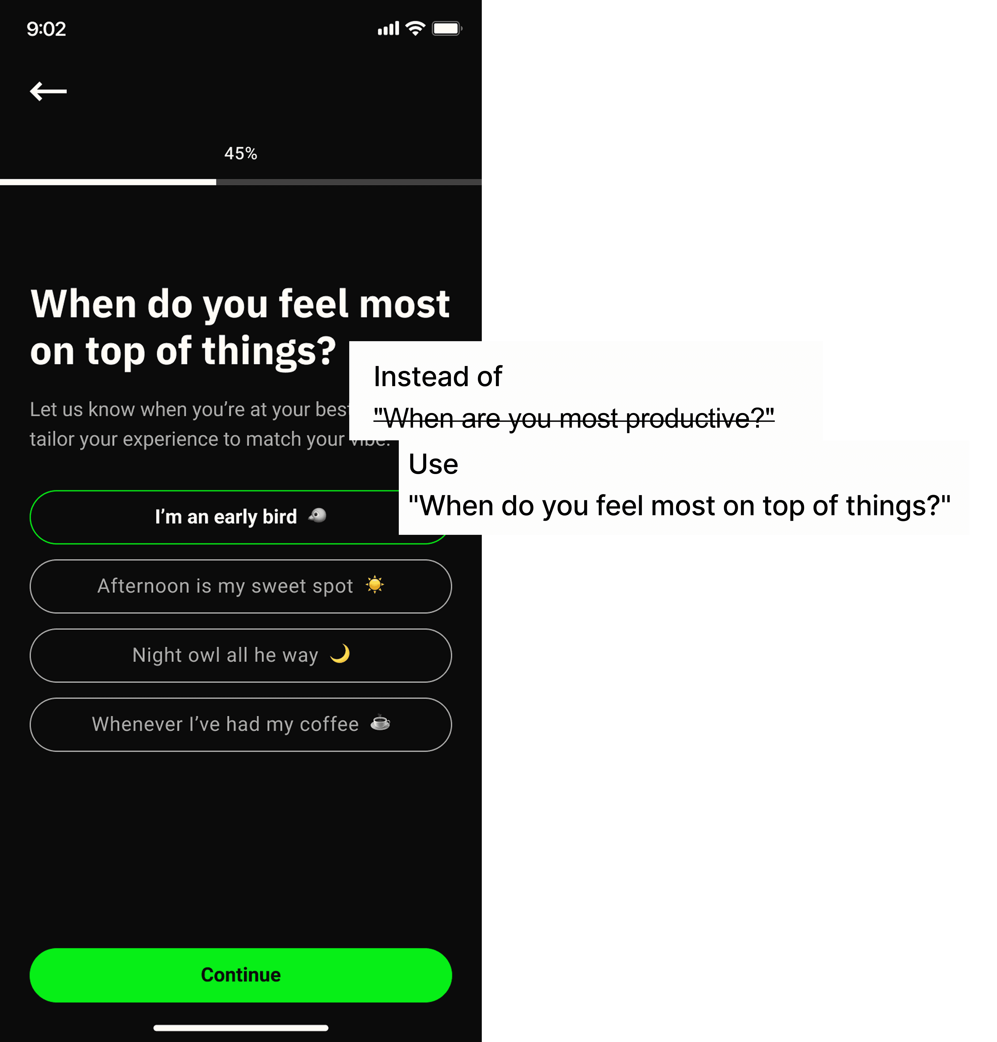
Context: reflections · check-ins · encouragement · onboarding
Design Decisions
Key Design Moves
Each decision translated a specific research finding into a concrete improvement to visibility, discoverability, or flow.
Mondai chat
Move or emphasize entry point using expected placement patterns to match user mental models.
01
Milestones
Surface upcoming milestones directly in the journey and add a visible "View all" path.
02
Calendar sync
Expose sync controls through more expected account and calendar pathways.
03
Onboarding
Use progressive questioning and clearer next steps to build context without friction.
04

Testing and Impact
Validation
85% → 100%
Success rate for note-taking feature
<2min → <30s
Time on task improvement
3.7 → 4.2
Ease score improvement (out of 5)
Reflection
Learnings
This project changed how I think about AI product design. The hardest part was not designing a screen. It was designing how the system should behave when the user is uncertain, incomplete, or exploring something new.
In early-stage AI products, the experience is shaped as much by logic and language as by layout. This internship taught me how to use research, content, and interaction thinking together, to make an emerging product feel more understandable and useful.
Here is another project I worked on!

Structuring how Google surfaces information to
everyday users
Content Strategy
Learning Experience
UX Research
↑ 55%
Engagement with interactive content
↓ 40%
Time to find relevant instructions
↑ 80%
due to task
success rate
Want me to scale your product with you?
Let's chat!